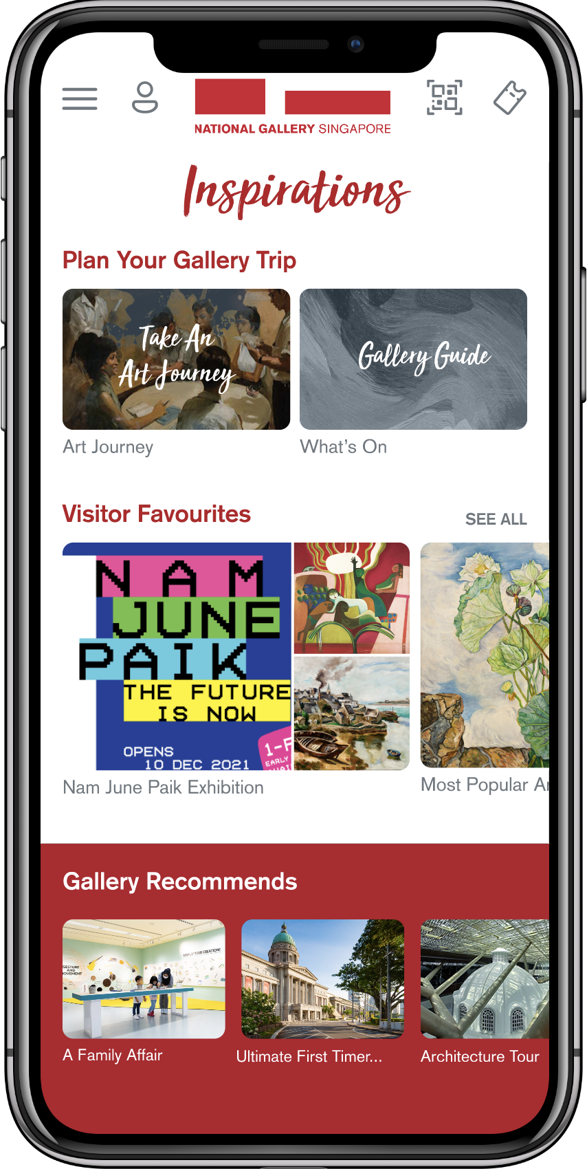
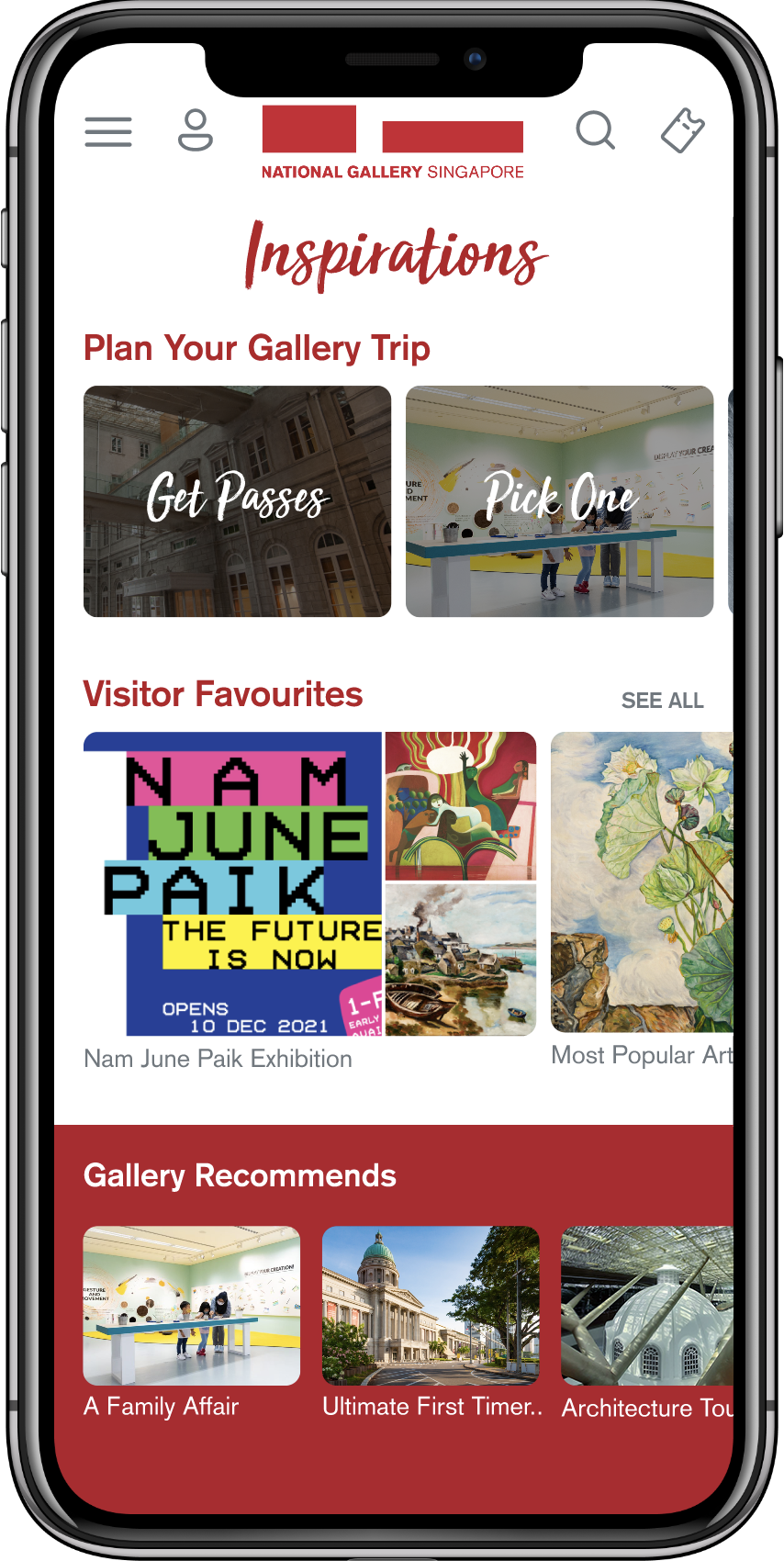
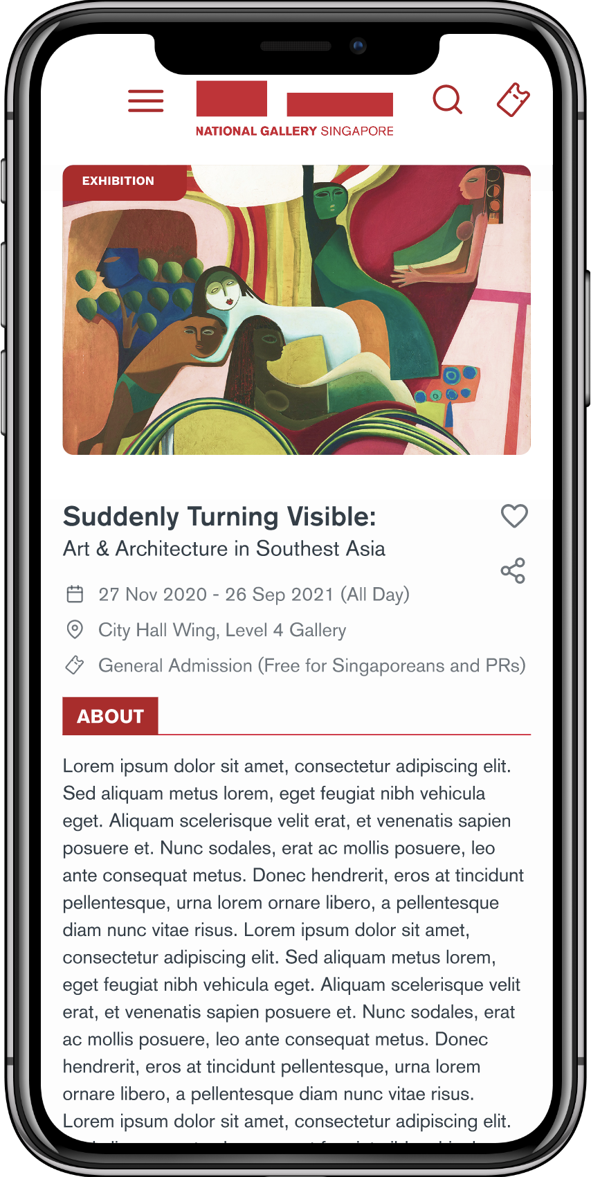
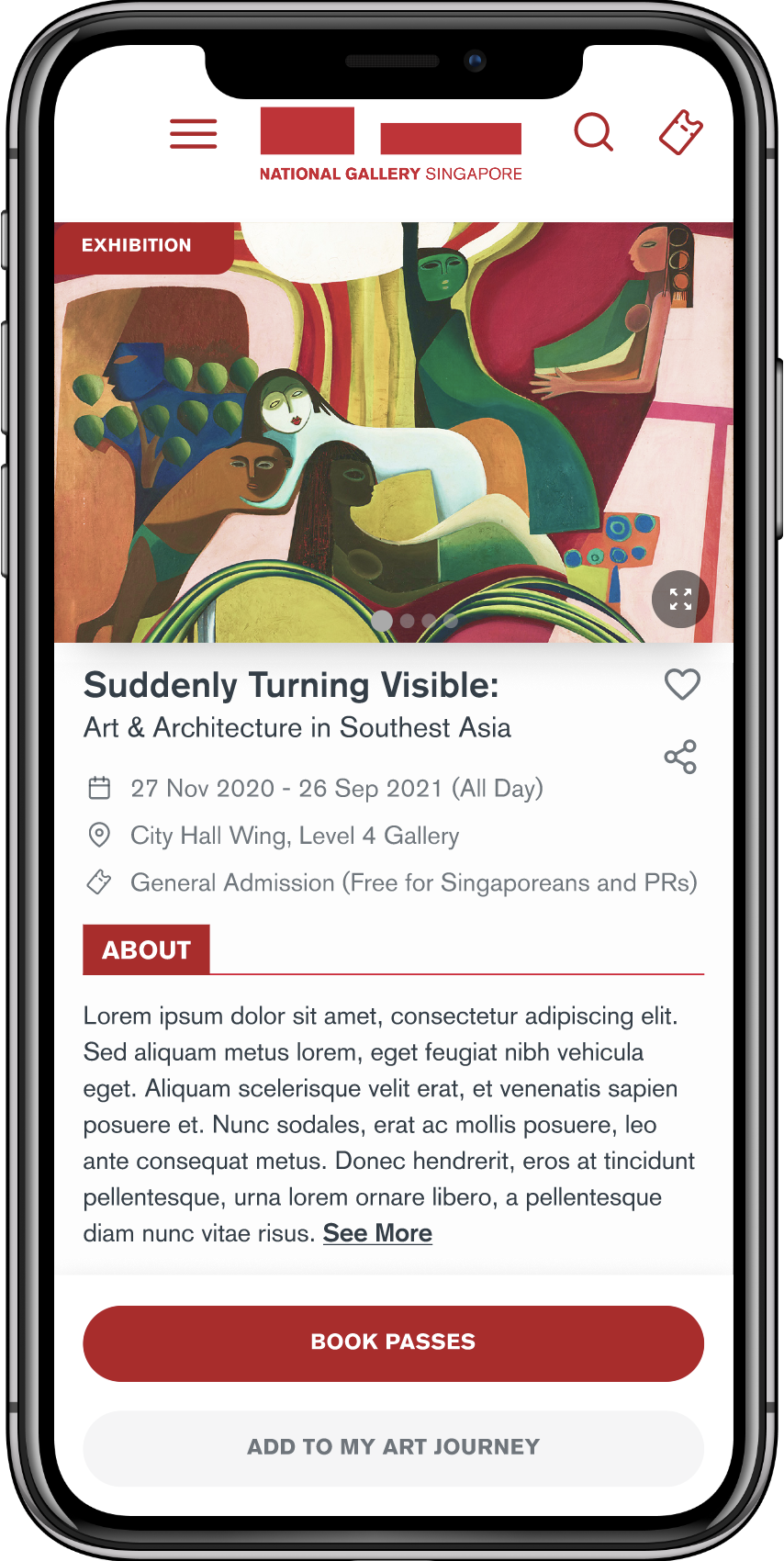
Led usability research with 34 gallery visitors across 4 user segments, uncovering critical barriers for older visitors
Delivered a phased, evidence-based redesign of the gallery's Progressive Web App and designed the companion kiosk experience.
Joined an ongoing project to build a Progressive Web App for the National Gallery Singapore. The existing design had incomplete flows, missing screens, and had never been tested with real visitors. I brought the prototype to a testable state, then ran structured usability testing with 34 gallery visitors across 4 user segments. The research revealed that older visitors scored 10 points below the industry usability benchmark, with the "Art Journey" feature as the primary friction source. I delivered a phased redesign and designed a standalone kiosk interface extending the experience to a shared, on-site touchscreen.
ROLE
Product Designer
DETAILS
User Flow Mapping • Screen Design • Prototyping • Usability Testing • Analysis • Redesign • Kiosk Design
TEAM
Design lead + 1 designer, 1 PM, 1 BA, dev team (SG + China), QA
TIMELINE
~12 months
The National Gallery Singapore had been developing a Progressive Web App for over a year before I joined — designed to help visitors plan gallery trips, explore art collections, purchase passes, and navigate the gallery during their visit. A principal designer had established the initial concept and screen designs but had departed the project before the design was complete.
When I came on board, I found a product with significant gaps: user flows were partially mapped but incomplete, several screens were missing across key interaction paths, and the prototype had so many broken links that it couldn't be tested end-to-end.
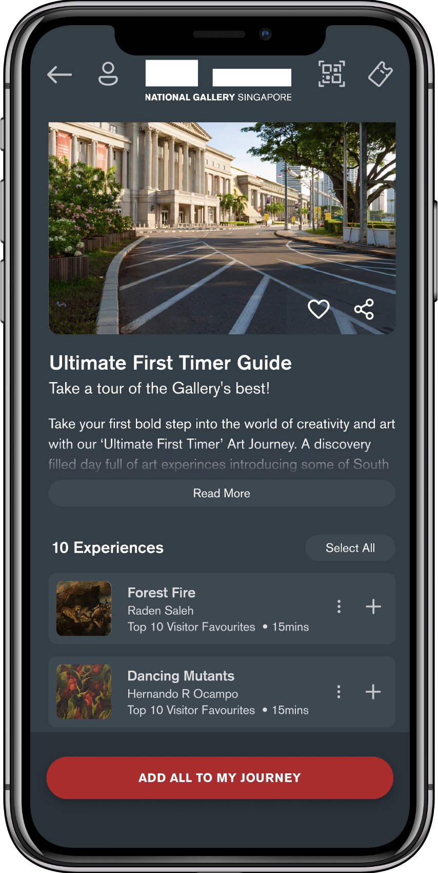
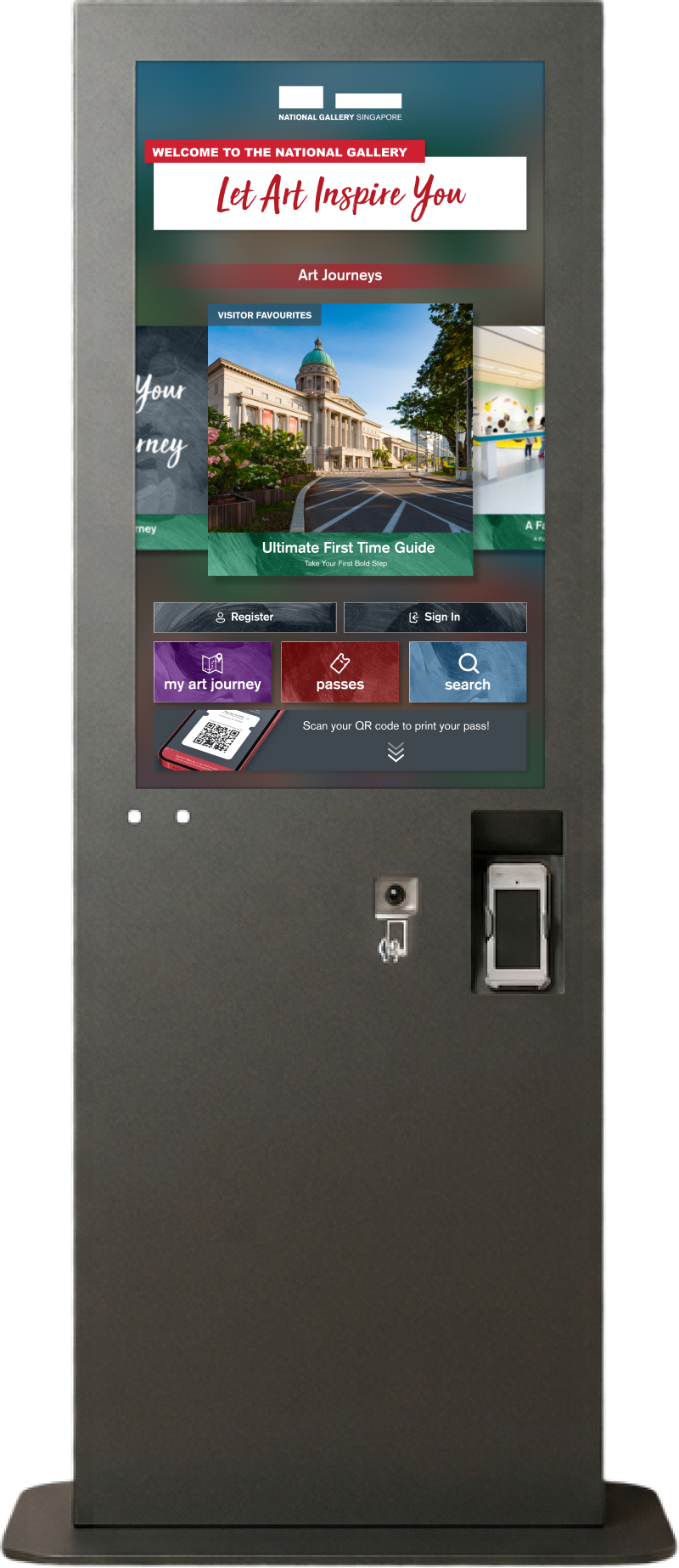
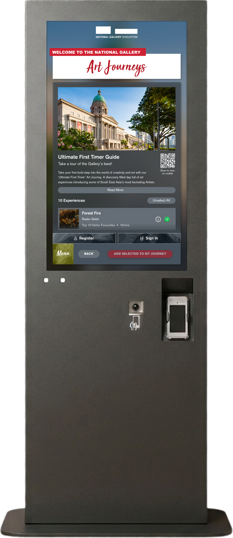
To validate the PWA before committing to further design investment, I designed and ran a structured usability study with real gallery visitors. The goal was twofold: test whether the core features were actually usable, and help the NGS team validate their product concept.
Based on existing visitor data and the NGS team’s observations, we identified two primary axes that would shape how visitors interacted with the PWA: digital comfort (immigrants vs. natives) and visit intent (planned vs. unplanned). This gave us four distinct segments to test against.
I wrote test scripts combining task-based scenarios with think-aloud protocol. Participants attempted core PWA tasks while narrating their thought process. We captured quantitative data (SUS, SEQ, task success rate, time-on-task) and qualitative data (verbal feedback, behavioural observations).
Scenario-based tasks where participants narrated their actions and reasoning as they navigated the PWA.
After each task, participants rated perceived difficulty — revealing which specific features felt hardest to use.
Post-session standardised questionnaire scoring overall usability. Industry benchmark: 68.
Binary pass/fail for each task plus time taken — revealing where information architecture and flows were failing users.
We used affinity mapping to cluster observations across all 34 participants, then layered in quantitative data to identify where the most severe usability gaps lived and which user segments were most affected.
OVERALL SUS
Just above the industry benchmark of 68. 21 of 34 participants scored above standard.
DIGITAL IMMIGRANTS
Below industry benchmark. Only 5 of 13 participants scored above standard.
DIGITAL NATIVES
Above industry benchmark. 16 of 21 participants scored above standard.
10-point SUS gap between digital immigrants and natives. When cross-referenced with SEQ scores and task success rates, the Art Journey feature was the primary culprit. Digital immigrants couldn’t figure out how to create one, didn’t understand why they’d want one, and hit a dead end at the Journey Bundle page. The overall 69.8 was being propped up by digital natives — the product was effectively failing its most vulnerable user segment.
WOULD USE THE PWA
Only 19% said they wouldn’t use it.
FELT EXPERIENCE WAS PERSONALISED
Core value proposition resonated with the majority.
WANTED CONCIERGE
Most-requested use case was practical info and support.
The research gave us a clear prioritisation framework. We divided the redesign into two phases: Phase 1 — “Standard of Living” (critical usability barriers), and Phase 2 — “Quality of Living” (ease-of-use and feature comprehension).
These changes addressed the top issues from affinity mapping — barriers directly preventing task completion or causing misunderstanding of critical information.
BEFORE

Inspirations page overhaul
Replaced QR icon with magnifying glass, redesigned Art Journey cards, increased font sizes.
AFTER

BEFORE

Visual-first exhibition details
Expanded hero image, added carousel indicators, truncated About copy with See More.
AFTER

BEFORE

Post-purchase clarity
Added explicit step-by-step instructions after purchase, clearly communicating the physical pass requirement.
AFTER

BEFORE

Artwork interaction discoverability
Added kebab menu icon to artwork cards to signal available interactions.
AFTER

BEFORE

Scroll affordance on Gallery Passes
Added visible scroll bar indicator to signal more content below the fold.
AFTER

BEFORE

Navigation readability
Increased font size across the navigation menu for digital immigrants.
AFTER

With critical blockers resolved, Phase 2 tackled the structural issues that made features confusing — particularly the Art Journey purchase flow.
BEFORE

Simplified Journey Purchase
Made “Your Chosen Art Journey Requires” more prominent, removed second bundle to eliminate confusion.
AFTER

BEFORE

Experience selection & interaction clarity
Changed expand icon, increased contrast, changed “Add All” to “Add Selected to My Journey.”
AFTER

The research clearly flagged “Art Journey” as a problematic term. We recommended renaming it, but the NGS steering committee chose to keep the name — it was tied to the gallery’s broader brand narrative. Rather than push against a firm stakeholder position, we redirected design effort toward reducing downstream confusion: simplifying the purchase flow and making the feature’s purpose clearer through context and visual cues rather than relying on the label alone.
Alongside the PWA redesign, I designed a standalone kiosk interface for the gallery floor. The kiosk shared core features with the PWA but needed to work for visitors standing in the gallery, looking for immediate orientation. It featured Art Journey browsing, pass access, artwork information with QR codes bridging to the visitor’s mobile device, and adapted interaction patterns for a shared, public touchscreen.


Concept validation confirmed the product had a clear reason to exist — visitors wanted it before and during their gallery experience.
Structured usability research across 4 segments — digital immigrants/natives × planned/unplanned visitors — using SUS, SEQ, and think-aloud protocol.
Evidence-based prioritisation: Phase 1 fixed critical task-blocking usability issues; Phase 2 addressed feature comprehension and flow simplification.